Seedream 5.5 vs Seedream 5.0 Pro: which should you choose when a product image needs five consecutive edits? We tested both through JXP to see whether they could preserve label details, follow material changes, and deliver usable files. The comparison includes repeated product and poster prompts, a five-step editing chain from the same reference, and downloaded PNG checks for real transparency.
Both models handled our English copy well. Seedream 5.5 followed the matte-material instruction more closely and exported real transparency through JXP’s background option. Seedream 5.0 Pro completed controlled revisions, although its chain introduced a glossier object and a brighter wall.
These are observations from 20 outputs generated on November 12, 2026. The tests were prepared for JXP’s blog using its own interface; they describe that workflow, including the controls and credit quotes available that day.
Seedream 5.5 vs Seedream 5.0 Pro: Results at a Glance
For this product-design workflow, we would start with Seedream 5.5 on JXP. It followed our matte-sphere instruction more closely, its background setting produced an actual transparent PNG, and each tested request displayed a lower credit quote. Both models delivered correct English poster copy and completed the final capacity-text change.
Test | Seedream 5.5 | Seedream 5.0 Pro | Practical takeaway |
|---|---|---|---|
Product concept, two attempts | Requested label text correct in both | Requested label text correct in both | Both can produce useful starting concepts |
English poster, two attempts | Supplied copy correct in both | Supplied copy correct in both | No text-accuracy winner in this sample |
Replace fruit with matte sphere | Matte appearance | Noticeably glossy highlights | 5.5 followed this material instruction more closely |
Recolor bottle, preserve blue label | Blue NORTH lettering retained | Blue NORTH lettering retained | Explicit preservation instructions helped both |
Fifth edit: 500 ml → 750 ml | Correct; NORTH remained blue | Correct; NORTH remained blue | Both completed the targeted text change in this chain |
Transparent bird PNG | Actual alpha with transparent setting | Opaque white background from prompt-only request | Different JXP controls affect the export workflow |
Visible quote per tested 2K request | 2 credits | 4 credits | Compare current settings before generating |
How We Tested Both Models on JXP
Matching prompts and an identical editing source
We used the 2K setting and requested one image per submission. Product images and edits used a 3:2 aspect ratio; posters and transparent-background requests used 1:1. The downloaded landscape images were 2496 × 1664 pixels, and square images were 2048 × 2048 pixels.
Each model generated two independent product images and two independent posters. We kept both attempts rather than choosing only the strongest example. For editing, both models received the same previously generated bottle scene. After each revision, that model’s own output became its next reference. Neither chain received the other model’s result or a fresh reset to the original.
Each model completed one five-edit chain and one transparency request. The 20 outputs are not 20 independent reliability trials: later edits inherit earlier results. They illustrate specific outcomes, rather than average success rates.
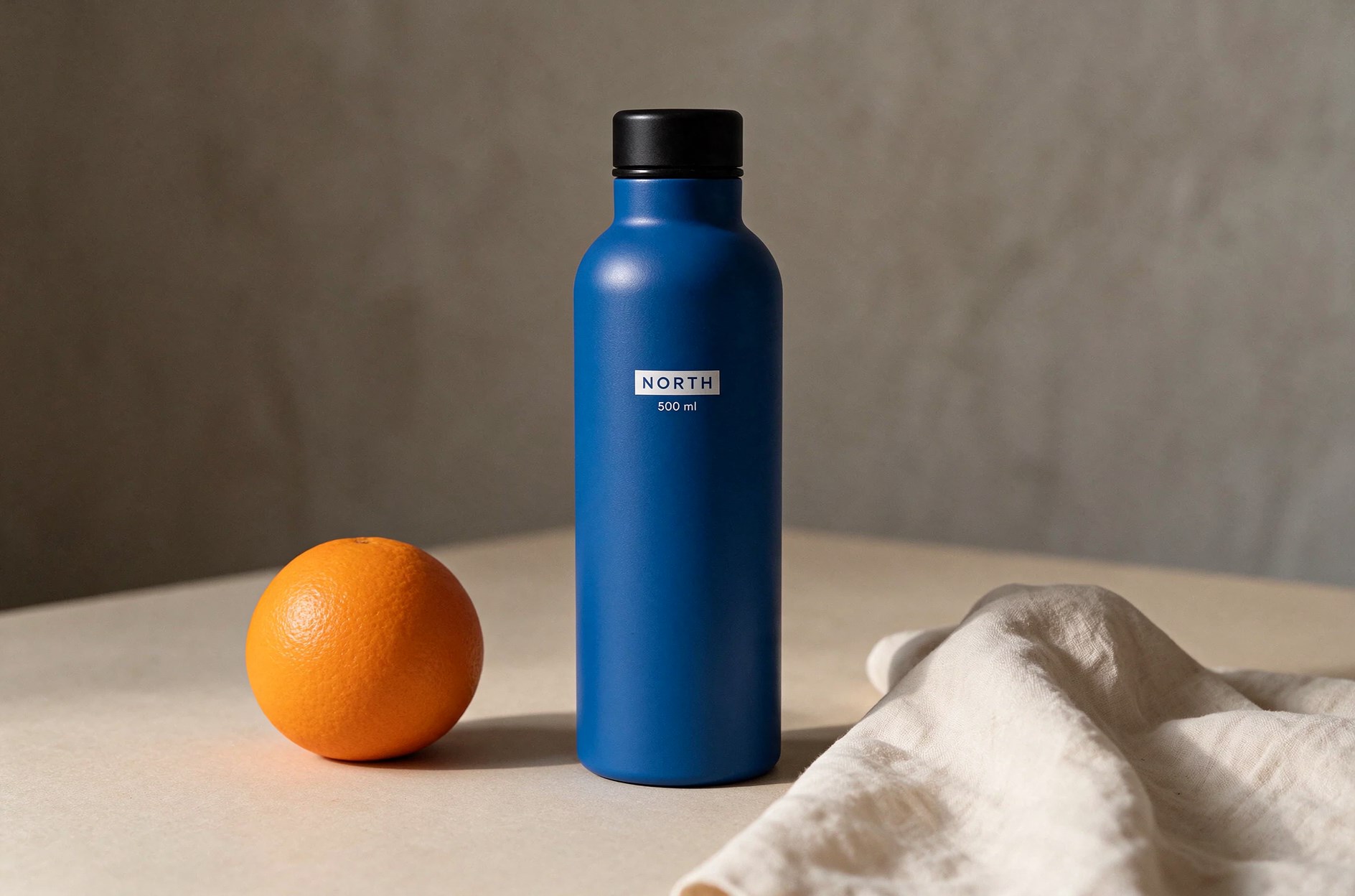
The identical starting reference. This older synthetic image is an input, not a new result credited to either model.
Before comparing results, we defined the details to preserve: the NORTH name and its blue color, capacity text until intentionally changed, black cap, bottle silhouette, object placement, and framing. For posters, we checked complete wording, dates, and price. For transparency, we examined the downloaded file rather than trusting its filename or preview.
Settings that could not be made identical
Seedream 5.5 exposed a reference-strength control, left at its default 0.50, and a background setting. We selected opaque for ordinary tasks and transparent for the cutout test. Seedream 5.0 Pro exposed PNG output, which we selected, but its visible form did not provide equivalent reference-strength or background controls.
This compares the two JXP workflows under the closest visible settings we could match. Results reflect both the models and the controls available. We did not benchmark API performance, standardized latency, or other resolutions. Text checks covered the supplied English copy; other languages, dense copy, and editable text layers were outside the test.
The comparison images below are resized and labeled for reading. The transparency panel composites the original downloads over white and dark backgrounds. We did not retouch their labels, replace generated objects, or remove backgrounds to improve a result.
Product Image Generation: Both Deliver a Useful First Draft
Our product brief asked for a frosted pale amber pump bottle with a brushed silver dispenser. The cream label had to read “FIELD,” “HAND WASH,” and “250 ml.” A navy linen towel belonged on the left, a white ceramic sphere on the right, with soft window light from the left.
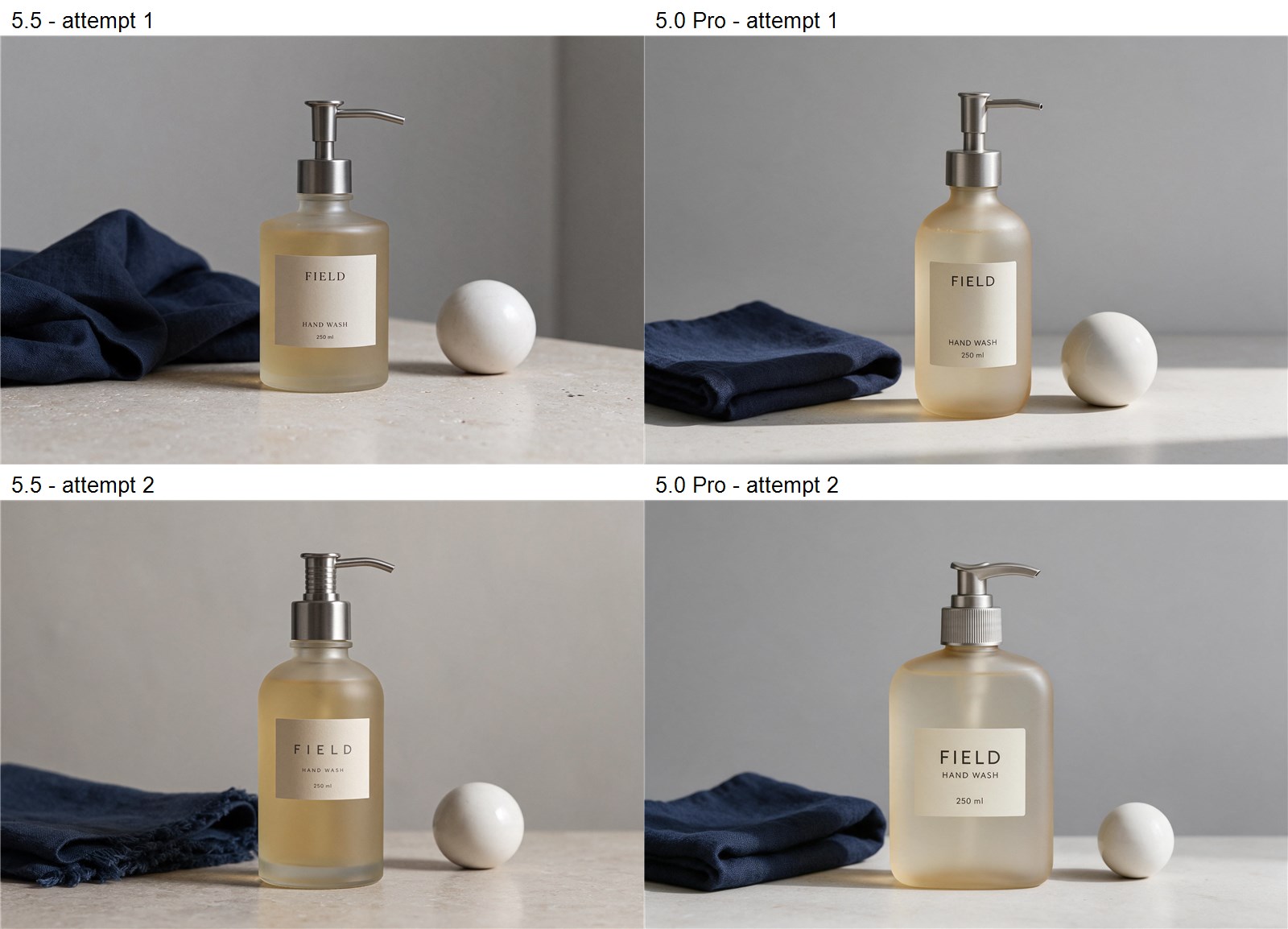
Seedream 5.5 is on the left; Seedream 5.0 Pro is on the right. Both independent attempts are shown.
Both models delivered the requested objects and readable label copy in both attempts. The glass, metal pump, fabric, and stone surface were visually plausible enough for a concept discussion. Either provided a useful starting point for this product photography brief.
However, repeated generations changed the design. Seedream 5.5 varied the bottle shoulders, label spacing, and towel edge. Seedream 5.0 Pro also varied the pump and silhouette, with a broader, squatter bottle in its second attempt. Those changes matter if you are producing a consistent product range rather than exploring possible designs.
Product concepts and exact SKU reproduction are different tests
There was no real manufactured bottle to match in this text-to-image exercise. We could judge prompt compliance and visual plausibility, but not reproduction of a real SKU. A convincing pump bottle is not evidence that a model preserves your actual packaging dimensions or artwork.
For ecommerce product image editing, start with an approved reference and evaluate revisions against it. The next test does that at the scene level. It asks whether the same bottle, label, and arrangement survive successive changes, which is more useful than picking the prettiest first generation.
Five Consecutive Edits: Where the Workflows Diverged
The shared reference contained a blue bottle with a black cap, blue NORTH lettering on a white label, and small white “500 ml” text below. An orange sat on the left, with cream linen on the right. We requested one main change per step and explicitly described what should remain.
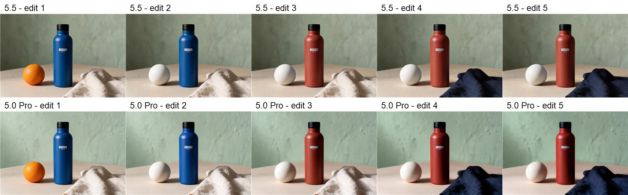
Each row is its own chain. The five columns show the five successive revisions, with no reset between steps.
Edits 1–2: Change the wall, then replace the orange
First, we changed the gray wall to pale sage green. Both models retained the bottle, cap, readable label, and overall arrangement. Seedream 5.5 produced a subdued sage wall. Seedream 5.0 Pro made it brighter, closer to mint, and more visibly textured. Both are recognizable interpretations of green, but the difference became part of every later frame.
Next, we replaced only the orange with a smooth matte white ceramic sphere of the same size and position. Both made the replacement. Seedream 5.5’s sphere had soft shading consistent with the requested matte surface. Seedream 5.0 Pro introduced sharper, window-like highlights that made its sphere look glossy.
That was the clearest instruction-following difference in the chain. A glossy sphere can be attractive, but “matte” was part of the brief. In a real campaign, a material mismatch may trigger another revision even when the composition looks finished.
Edit 3: Recolor the bottle without recoloring NORTH
The third request changed the bottle body from blue to matte terracotta red. We explicitly protected the label: “Keep the black cap, bottle silhouette and position, NORTH and 500 ml label exactly unchanged, including the original blue NORTH lettering.”
Both models kept NORTH blue and preserved the readable capacity text while recoloring the bottle. Their terracotta shades differed, but neither changed the brand name to match the bottle color. For this task, label-color preservation was a shared success.
Prompt wording mattered: “Keep the label” is less specific than naming its wording, color, and placement. Both models received the same explicit preservation instruction.
Edits 4–5: Change the linen, then the capacity text
The fourth edit changed cream linen to dark navy while requesting the same folds, outline, and position. Both changed the cloth color and kept the scene recognizable. The earlier material and wall differences remained: a matte sphere and quieter wall in 5.5, a glossy sphere and brighter textured wall in 5.0 Pro.
Finally, we asked to change only “500 ml” to “750 ml,” protecting NORTH and the rest of the scene. Both final images displayed “750 ml” correctly and kept the brand name blue. The cloth remained navy, the cap black, and the bottle terracotta. Seedream 5.5’s label looked crisper in this pair; Seedream 5.0 Pro’s lettering was softer. That is a visual observation from these downloads, rather than a measured sharpness score.
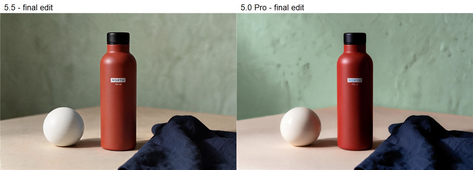
Compare the final label, sphere finish, wall, and fabric with the common source and intermediate frames.
These were visually controlled edits, not pixel-identical preservation. Small changes in texture, shading, and letter rendering can matter when a brand has strict artwork standards. Inspect an output at full size before approving it, even when the thumbnail appears stable.
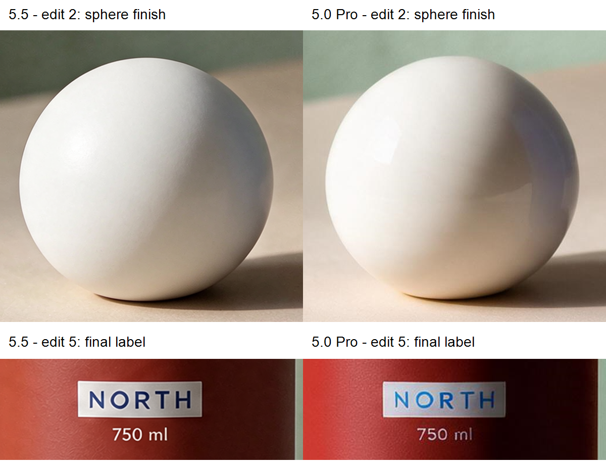
Detail crops from the unretouched downloads, using identical crop coordinates and display scales for both models. Top: matte versus glossy sphere. Bottom: blue NORTH and the updated capacity.
Inspect the original final files: 5.5 full-size result and 5.0 Pro full-size result.
Copy the five-edit test
Start both chains with the same reference image. Use 2K, a 3:2 ratio, and one output per request. Leave 5.5 reference strength at 0.50 with an opaque background; select PNG in 5.0 Pro. Upload each model’s preceding result before its next prompt. These are the exact instructions we used:
Wall: Change only the warm gray wall background to a pale sage green wall. Preserve the blue bottle, black cap, exact NORTH and 500 ml lettering including their colors, orange fruit, cream cloth, tabletop, camera angle, crop, lighting direction, and all object positions.
Sphere: Replace only the orange fruit on the left with a smooth matte white ceramic sphere of the same size and position. Preserve the blue bottle, black cap, exact NORTH and 500 ml lettering including their colors, sage green wall, cream cloth, tabletop, crop, camera angle, and lighting.
Bottle: Change only the bottle body color from cobalt blue to matte terracotta red. Keep the black cap, bottle silhouette and position, NORTH and 500 ml label exactly unchanged, including the original blue NORTH lettering. Preserve the white sphere, sage wall, cream cloth, tabletop, camera angle, crop and lighting.
Linen: Change only the cream linen cloth on the right to dark navy blue linen. Preserve its exact folds, texture, outline and position. Keep the terracotta bottle, black cap, NORTH and 500 ml label including their current colors, white sphere, sage wall, tabletop, crop, camera angle and lighting unchanged.
Capacity: Change only the small white capacity text below NORTH from “500 ml” to exactly “750 ml”. Keep NORTH unchanged, including its letter shapes, current color and white label. Preserve the terracotta bottle body, black cap, white sphere, navy linen cloth, sage wall, tabletop, lighting, crop and camera angle.
English Poster Text: Four Correct Outputs, Different Layouts
We asked both models to design a square ceramics-workshop poster on warm ivory paper with cobalt typography and a small drawn bowl. Required text included “MAKE SOMETHING SLOW,” “Saturday pottery workshop,” “November 21, 2026,” “$48 per person,” and the complete footer: “Clay, tools, and firing included. Book by November 18.”
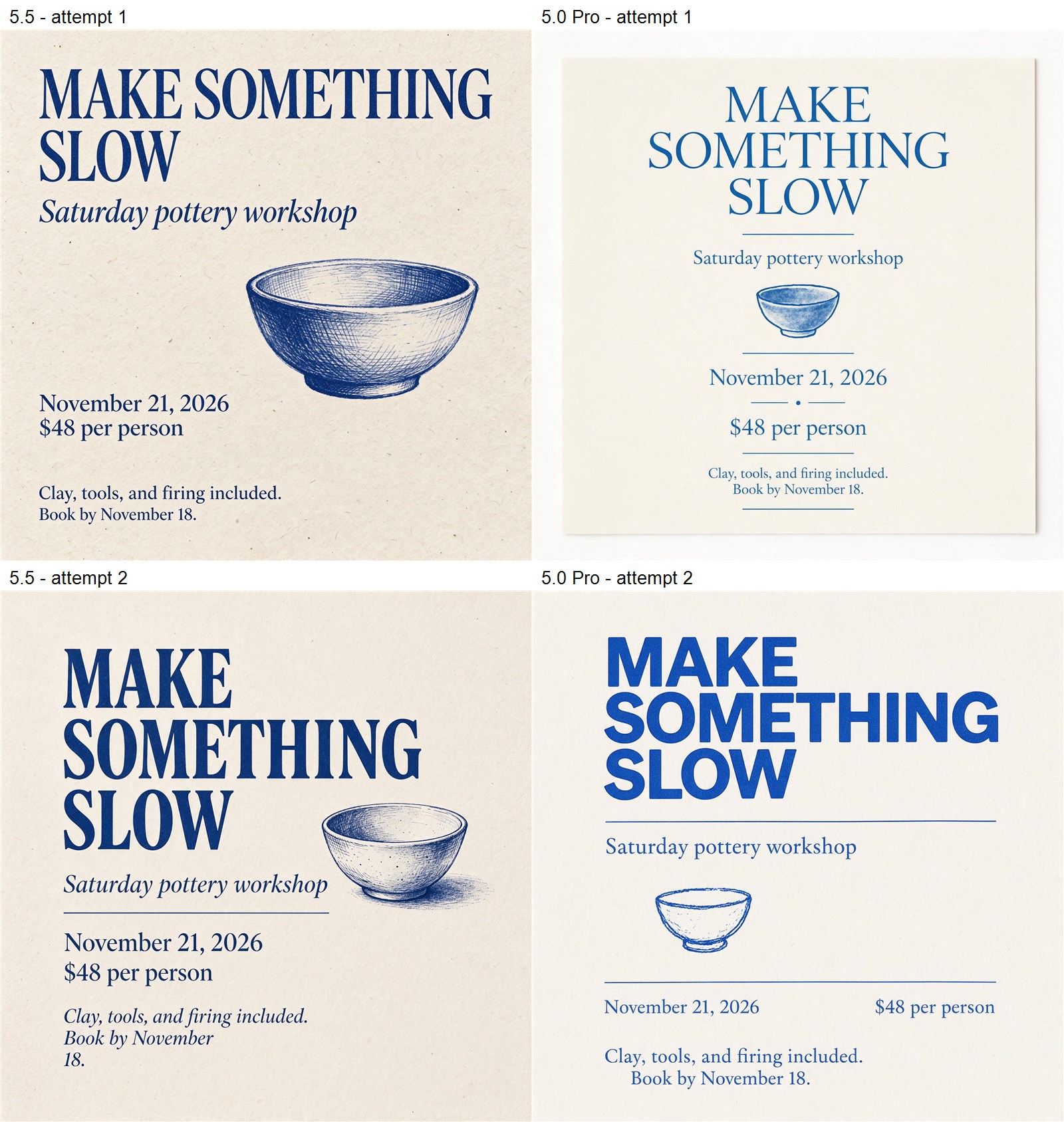
Both attempts from both models retained the supplied wording, dates, and price. Layout choices varied.
All four posters contained the requested copy correctly, with no additional wording observed. Seedream 5.5 favored serif headlines, textured paper, and crosshatched bowl drawings. Seedream 5.0 Pro varied between a centered serif composition and a larger sans-serif headline, with different date and price placement.
Line wrapping was allowed. One 5.5 output wrapped “Book by November 18” across lines while retaining the complete wording. For a client requiring one exact line, specify and test that constraint separately.
For this Seedream text rendering comparison, both models delivered readable event copy in two attempts. Choose between these examples on hierarchy, illustration style, and how the layout fits your intended placement.
Transparent PNG Test: Inspect the Downloaded File
For the transparency task, we requested an isolated cobalt ceramic bird with an alpha channel, no floor, no cast shadow, and no checkerboard pattern. Both used a square 2K request, but the available controls differed.
In Seedream 5.5, we selected the transparent background setting. Its downloaded 2048 × 2048 PNG contained actual transparency: the corner alpha was zero while the bird’s center was opaque. In Seedream 5.0 Pro, PNG was selected and transparency was requested in the prompt, but the downloaded file contained an opaque white background.
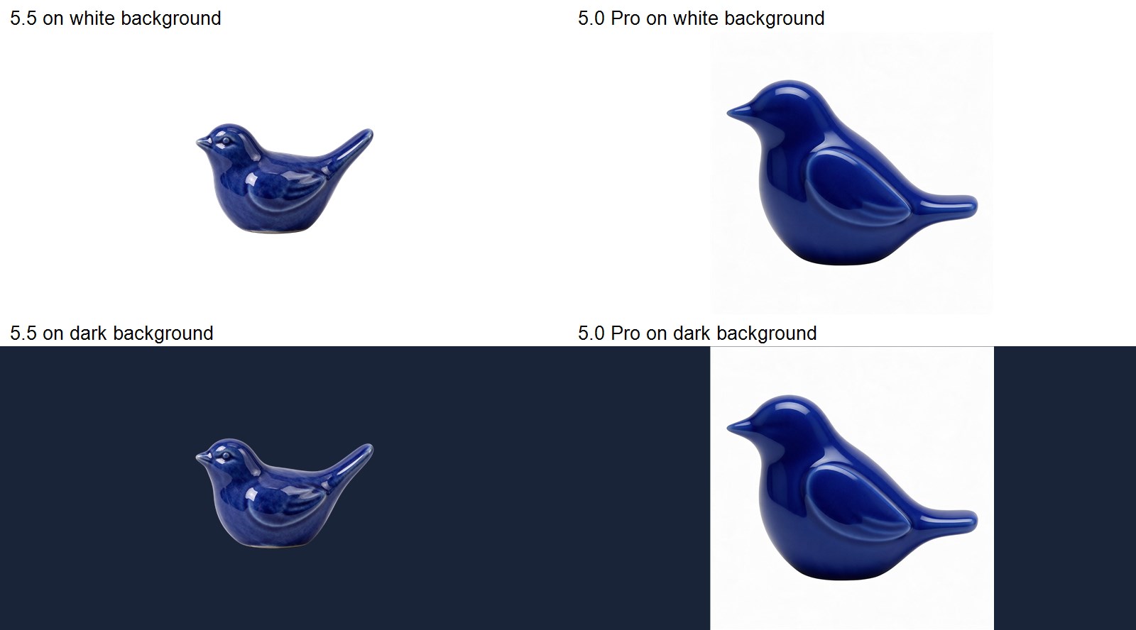
The same downloaded files appear over white and dark backgrounds. The white rectangle in the 5.0 Pro result remains visible on dark.
PNG format alone does not guarantee transparency
The 5.0 Pro result shows why a white preview and a PNG extension are insufficient checks. A useful cutout must allow the page background to show through. Our 5.5 download did; our prompt-only 5.0 Pro download did not.
For a transparent PNG workflow on JXP, 5.5 was the more direct choice in this test. This does not prove that every deployment of Seedream 5.0 Pro lacks transparency. Its JXP form did not expose the same background option, so we cannot separate that interface difference from the underlying generation behavior.
Credit Costs: Compare the Same Settings
Each tested 2K request displayed a quote of 2 credits for Seedream 5.5 and 4 credits for Seedream 5.0 Pro. Each model generated ten outputs: two products, two posters, five edits, and one bird. The sum of displayed quotes was therefore 20 credits for 5.5 and 40 credits for 5.0 Pro.
Those are interface quotes from the test date, not a reconciliation of isolated account debits or a promise about future pricing. We did not convert them into dollar costs or assume that every resolution and configuration has the same rate. Check the current quote before submitting your own request.
For a five-edit chain at these settings, the quoted totals were 10 versus 20 credits. A lower quote helps, but missed material instructions can add correction work. Track the revisions needed for your own approval standard to compare actual workflow costs.
Which Model Should You Choose?
Choose Seedream 5.5 first if your JXP workflow involves repeated product revisions, material-specific instructions, or transparent assets. It followed our matte-sphere request more closely, provided a working alpha export through its background control, and displayed the lower quote in every tested task.
Keep Seedream 5.0 Pro in consideration if its visual treatment suits your brief or it already produces approved results for your team. It delivered readable product labels and complete English poster copy, preserved blue NORTH lettering during recoloring, and carried the scene through successive revisions. For poster work in particular, both earned consideration in this test.
For your own comparison, define the required wording, protected colors, materials, and export format first. Run both sequences, keep intermediate images, and record additional corrections against your approval standard.
FAQ
Is Seedream 5.5 better than Seedream 5.0 Pro?
In our JXP tests, 5.5 was the stronger starting choice for the combination of material control, transparent export, and quoted credits. Both handled our English copy well. The sample is too small to establish a universal quality ranking across styles and workloads.
Which model is better for product image editing?
Seedream 5.5 followed the matte-material requirement more closely in our bottle scene. Both retained the brand name and its blue color through recoloring. Test your own packaging artwork and required edits before treating either as suitable for exact product reproduction.
Can Seedream 5.0 Pro generate accurate text?
It correctly rendered the supplied product label in both attempts and the complete English poster copy in both attempts. That supports its usefulness for these briefs, while leaving dense text, other languages, and strict typography requirements untested.
Does Seedream 5.5 generate a real transparent PNG?
Our JXP download did when the transparent background setting was selected. We verified the alpha channel and composited the original over a dark background. Check the actual export rather than assuming that every PNG has transparency.
Is Seedream 5.5 cheaper on JXP?
For the tested 2K requests, its visible quote was 2 credits against 4 credits for 5.0 Pro. Rates can depend on the selected configuration and may change. Use the current generation quote when planning your own comparison.
Should I switch models for an existing campaign?
First compare both against an approved campaign reference. Check wording, color, materials, composition, and the final export. Switch when the new workflow gives you a measurable benefit in approvals or required corrections; our small test provides examples to inspect, rather than a substitute for that decision.